More than one element in the window
More than one element in the window
The contents of a scala.swing.Frame or scala.swing.MainFrame object is a single component. Typically, we want to show more things in a window than just a single label or a single button. That means that we have to worry about laying out multiple components.
Our next program, gui3.scala, uses a scala.swing.BoxPanel to arrange multiple components inside the window. So the window's (MainFrame's) contents is a BoxPanel, and the BoxPanel contains a label and two buttons:
import scala.swing._

class UI extends MainFrame {
  title = "GUI Program #3"
  contents = new BoxPanel(Orientation.Vertical) {
    contents += new Label("Look at me!")
    contents += Button("Press me, please") { println("Thank you") }
    contents += Button("Close") { sys.exit(0) }
  }
}

object GuiProgramThree {
  def main(args: Array[String]) {
    val ui = new UI
    ui.visible = true
  }
}
The assignment
  contents = new BoxPanel(Orientation.Vertical) {
    contents += new Label("Look at me!")
    contents += Button("Press me, please") { println("Thank you") }
    contents += Button("Close") { sys.exit(0) }
  }
creates a new object of a class that extends BoxPanel. The
three lines that add a label and two buttons to the contents of this
object form the constructor of this nameless class. We could instead
have written the UI class like this:
class UI extends MainFrame {
  title = "GUI Program #3"
  val box = new BoxPanel(Orientation.Vertical)
  box.contents += new Label("Look at me!")
  box.contents += Button("Press me, please") { println("Thank you") }
  box.contents += Button("Close") { sys.exit(0) }
  contents = box
}
However, this style is less common in Scala.
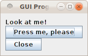
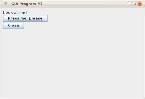
The window looks like this:

If you change Orientation.Vertical to Orientation.Horizontal, the window will look like this:

class UI extends MainFrame {
  title = "GUI Program #3"
  contents = new BoxPanel(Orientation.Vertical) {
    contents += new Label("Look at me!")
    contents += Button("Press me, please") { println("Thank you") }
    contents += Button("Close") { sys.exit(0) }
    border = Swing.EmptyBorder(10, 10, 10, 10)
  }
}
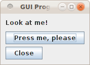
It will look like this (the four numbers indicate the top, left,
right, and bottom border width in pixels):

  border = Swing.BeveledBorder(Swing.Lowered)
  border = Swing.BeveledBorder(Swing.Raised)
  border = Swing.MatteBorder(10, 10, 10, 10, java.awt.Color.WHITE)
  border = Swing.TitledBorder(Swing.LineBorder(java.awt.Color.RED), "Fun")
  border = Swing.TitledBorder(Swing.EtchedBorder(Swing.Lowered), "Fun")
  border = Swing.CompoundBorder(Swing.BeveledBorder(Swing.Lowered),
                                Swing.EmptyBorder(10, 10, 10, 10))
You can find pictures of these borders on the Java
website.
The buttons are still too close together. Also, what happens when you resize?

class UI extends MainFrame {
  title = "GUI Program #3"
  contents = new BoxPanel(Orientation.Vertical) {
    contents += new Label("Look at me!")
    contents += Swing.VStrut(10)
    contents += Swing.Glue
    contents += Button("Press me, please") { println("Thank you") }
    contents += Swing.VStrut(5)
    contents += Button("Close") { sys.exit(0) }
    border = Swing.EmptyBorder(10, 10, 10, 10)
  }
}

We only discussed the BoxPanel here, but there are other useful panels that layout their elements in a different way: FlowPanel, BorderPanel, GridPanel, and GridBagPanel.