Components
Components
Now let's try out some of the components provided by Swing. We have already met scala.swing.Label and scala.swing.Button. The following program gui5.scala shows a few more:
import scala.swing._

class UI extends MainFrame {
  def restrictHeight(s: Component) {
    s.maximumSize = new Dimension(Short.MaxValue, s.preferredSize.height)
  }

  title = "GUI Program #5"

  val nameField = new TextField { columns = 32 }
  val likeScala = new CheckBox("I like Scala")
  likeScala.selected = true
  val status1 = new RadioButton("학부생")
  val status2 = new RadioButton("대학원생")
  val status3 = new RadioButton("교수")
  status3.selected = true
  val statusGroup = new ButtonGroup(status1, status2, status3)
  val gender = new ComboBox(List("don't know", "female", "male"))
  val commentField = new TextArea { rows = 8; lineWrap = true; wordWrap = true }
  val pressMe = new ToggleButton("Press me!")
  pressMe.selected = true

  restrictHeight(nameField)
  restrictHeight(gender)

  contents = new BoxPanel(Orientation.Vertical) {
    contents += new BoxPanel(Orientation.Horizontal) {
      contents += new Label("My name")
      contents += Swing.HStrut(5)
      contents += nameField
    }
    contents += Swing.VStrut(5)
    contents += likeScala
    contents += Swing.VStrut(5)
    contents += new BoxPanel(Orientation.Horizontal) {
      contents += status1
      contents += Swing.HStrut(10)
      contents += status2
      contents += Swing.HStrut(10)
      contents += status3
    }
    contents += Swing.VStrut(5)
    contents += new BoxPanel(Orientation.Horizontal) {
      contents += new Label("Gender")
      contents += Swing.HStrut(20)
      contents += gender
    }
    contents += Swing.VStrut(5)
    contents += new Label("Comments")
    contents += Swing.VStrut(3)
    contents += new ScrollPane(commentField)
    contents += Swing.VStrut(5)
    contents += new BoxPanel(Orientation.Horizontal) {
      contents += pressMe
      contents += Swing.HGlue
      contents += Button("Close") { reportAndClose() }
    }
    for (e <- contents)
      e.xLayoutAlignment = 0.0
    border = Swing.EmptyBorder(10, 10, 10, 10)
  }

  def reportAndClose() {
    println("Your name: " + nameField.text)
    println("You like Scala: " + likeScala.selected)
    println("Undergraduate: " + status1.selected)
    println("Graduate: " + status2.selected)
    println("Professor: " + status3.selected)
    println("Gender: " + gender.selection.item +
	    " (Index: " + gender.selection.index + ")")
    println("Comments: " + commentField.text)
    println("'Press me' is pressed: " + pressMe.selected)
    sys.exit(0)
  }
}

object GuiProgramFive {
  def main(args: Array[String]) {
    val ui = new UI
    ui.visible = true
  }
}
The window looks like this:
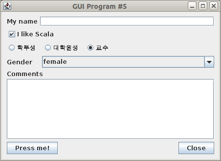
Let's go through the new components one by one:
TextField
A scala.swing.TextField allows the user to enter a single line of text. The columns attribute indicates how large I want the field to appear, it doesn't restrict the length of the string that can be entered. We can access the string as the text attribute.
CheckBox
The user can turn a scala.swing.CheckBox on or off. We can also set it on or off by setting its selected field to true or false. By default it would be off, so I set it to make sure the box is checked when the window appears.
RadioButton
Similar to a CheckBox, but a scala.swing.RadioButton is meant to be used in a group. When one is selected, all others are automatically deselected, so that only one RadioButton is selected at any time. We need to create a scala.swing.ButtonGroup to tell Swing which buttons belong together.
ComboBox
A scala.swing.ComboBox allows the user to select one of possibly many options. Only the selected option is shown at any time, the rest are available in a pop-up menu. We can retrieve and change the current option using the selection attribute: its index field contains the index of the current option, its item field contains the actual option.
TextArea
A scala.swing.TextArea is like a TextField, but permits the entry of text that spans several lines (and is possibly quite long). We set rows to indicate the number of lines of text that should fit in the window (but it can still be resized). lineWrap indicates that text lines that do not fit in one row should automatically continue in the next row, and wordWrap means that this should only happen between words.
By default, a TextArea does not have scrollbars. To allow more text to be added than fits into the field, we can place the TextArea inside a scala.swing.ScrollPane, as I have done here.
ToggleButton
A scala.swing.ToggleButton is like a scala.swing.Button, except that it remembers its current state. Press it once to turn it on, press it again to turn it off. We can access the button's state through its selected attribute.
Layout
Note that I set the height in the maximumSize for the TextField and the ComboBox. This is to avoid these fields growing vertically when the user resizes the window. (Comment it out and try it!)
I also set xLayoutAlignment to zero for all components inside the main vertical BoxLayout. This ensures that they are all aligned at the left edge. Setting the value to one would align them along the right edge, setting it to 0.5 would center all components horizontally.